A couple of humble suggestions from a newbie: It seems like the level 1 chargers are also green (not grey as indicated by the FAQ), so I only have green and orange symbols on my map. I agree with some suggestions here that there could be more colors. I would reinstate the grey, make the orange more yellow-y, add red for over 100 kW and maybe black/blue/purple/something for over 300? One more color for megachargers? If it has been decided that grey should not be used and we should only have two colors, then the FAQ should be updated to reflect that.
Yes we should definitely revise our map icons and the FAW could be wrong. The terms ‘level 1’ and level 2’ refer to an outdated US standard where Level 1 is 120v AC so we’re trying to move away from using those references as they don’t make much sense and internationally they are very confusing (often confused with Type 1 and Type 2).
Move to icons based entirely on the (peak/max) kW range the site can offer is probably best, and I think we probably need one or more additional colours. Red might not work as it would normally mean danger, but maybe it would?
We intentionally based our current colour range on PlugShare, because in many markets its the defacto standard app, I don’t know if they are doing something different for iconography at high power statsions?
IMHO, we need to be cognisant of the 8% of the population that is colour-blind. This means that we shouldn’t use colour as the differentiator, and if we must, then we have to stay away from Green/Red combinations.
As far as colour goes, personally I think that green indicates good, orange indicates caution, and red indicates an error or a problem.
I would like to make up some icons, and then I’ll repost…
Ideas are very welcome, don’t go to too much effort in your first pass and check out what other (apps) are doing for iconography as well.
For info, our current icons are based on an SVG template then we auto generated the combinations:
The colour of the pin needs to stand out. Orange is good for this, as is green.
I like red, but it doesn’t really matter.
As far as information per location, what I think people want to see is:
-
- The number of stalls usable (i.e. not occupied, and not broken)
-
- The maximum speed of the available stalls (more on this below)
-
- The overall status (if it’s not “normal”)
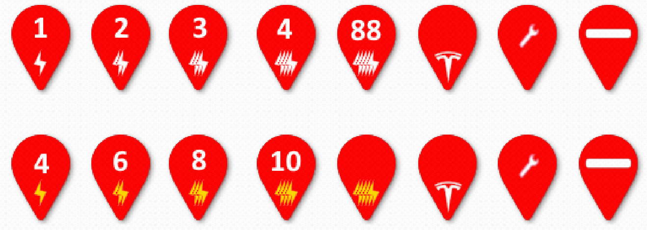
The majority of cars are now CCS, but it could be a charger that doesn’t work with your car - i.e. Tesla. So there also needs to be visibility of this. I’ve shown a Tesla logo to show a Tesla only stall.
I figure that there are 5 speeds for each of AC and DC:
< 4 kWhr (10A)
< 8 kWhr (15A)
< 12 kWhr (16A 3ph)
< 17 kWhr (20A 3ph)
< 22 kWhr (32A 3ph)
< 50 kWhr
< 80 kWhr
< 160 kWhr
< 300 kWhr
> 349 kWhr
In the below image, I show AC as white, and DC as yellow. It doesn’t matter what colour is used, so long as it stands out from the other. I used yellow as it kind of indicates a “gold standard”.
We should use Alt properties to explain exactly what each image is.
Each number refers to the number of available stalls.
The wrench means that all stalls are temporarily unavailable.
The bar means that there is restricted access.
What do you think?
Thanks! I like the stacked symbol to indicate more power.
Have you heard of Chargeway (https://www.chargeway.net/)? They are increasingly popular in the US and are heavily promoting a scheme where power banding is the number (e.g 1-9) and the colour indicates compatibility (I think).
I’m cautious of inventing something (e.g. number of stalls in marker, which we may not know) that will directly conflict with what’s gone before, but obviously this is just our visualisation of the data, and it has nothing to do with the data itself. [It could also be optional which visualisation you use in the app/map]
As an aside, our objective has not* been to make our app really popular, it’s to make the data popular in other apps (so they don’t build their own private data silo which needs independently maintained). That said, some websites etc. do embed our map, but it’s use probably pales in comparison to things like A Better Route Planner (who are one of our consumers).
Just visited their site. I liked the colours. But then I thought - why are there colours? If I can use CCS and Tesla, why don’t I just filter out the others?
Also, that 3 colour scheme is very simplistic. It would make zero sense to show 19 different coloured dots (to represent each of the 19 Standard Connection Types)
I don’t think that using a number to show range attained makes sense either. The speed at which your battery will charge is dependent upon your current SoC (no pun intended), and the manufacturer of your battery (as different cars can have different batteries), plus of course the EVSE.
Yeah to different people the various visualisations do or don’t make sense, but the data is still the same data.
Ok - so I think that’s set the tone. Let’s get the backend OCPI compliant (or we provide a “feed[s]” that is OCPI compliant) first. Once that’s done, we can play with the frontend.
The bad news is that I’m not a frontend guy. No Node, no Angular, little web really. I don’t even do MVVM.
Interesting considerations. We shouldn’t mess things up for color-blind people, of course.
The map is a visualization of our data, so it should probably be geared towards OCM contributors checking that the data is correct, so that updates can be done easily. How many of the chargers are occupied at a given moment is probably not something we should worry about, since we will not have half of that data in the next ten years in my estimation.
Dave’s pin design suggestions are interesting. It has the logo of one charger operator (Tesla). If we want that, logos for most other operators could be used and help with understanding which chargers are which, since there are often several different operators in a small area. That could replace the lightning symbols, and the numbers could then be white/gold for AC/DC?
Speaking of Tesla, I would consider borrowing the function from their supercharger map for easily turning categories of chargers invisible. I think that could help contributors getting an overview. But that may be a bit much work.
Of course, some locations will also have both AC and DC from the same operator and… Some chargers are combined CCS/Chademo or CCS/Tesla so one could say there are twice as many chargers as there are stalls… the world is messy. Thank you for trying to make some sense of it!
1 Like
Jumping on the bandwagon - can you consider utilising the logo to indicate what type of site is being viewed in terms of charger density? For example, show an enlarging grid structure or series of units to indicate more charging points?
This should obviously be linked into the overall discussion about the site grouping. Ideally a multi-homed site should be grouped by supplier and then within each supplier you can then see the various charging facilities (AC/DC…) by speed.
So a dense site would be grouped up into a parent module which expands into each supplier on selection and then out into the charging facilities, etc.
@Hjortefot the tesla filters are very nice, it’s a difficult feature to scale though as various people would want to see various filters depending on their view of how to should be presented. We do have filtering on the Settings page but it’s not that simple to use.
@RonnieLast the charge density visualisation idea is interesting, like a stacked icon for multiple operators etc. Differentiation of multi-operators sites is an interesting problem.
I think overall there are hundreds of ways the map markers could be presented and it doesn’t feel like there are any maps out there currently which have a definitive solution, suggesting that we won’t either. If anyone can point to example maps/apps with especially excellent map markers etc that would be great.
We do have the technical ability/possibility to dynamically generate map markers based on criteria, user preferences, visualisation schemes etc but that would be a project in itself for someone.
I’m confident that one single set of map markers is not going to satisfy everyone or accommodate every way of looking at the data. If we have folks with a design background or who are technically interested in how we compose the map markers currently (they are SVG with a python script to compose and export the combinations) then please do have a look and see what you can come up with.
Script: ocm-docs/generate_markers.py at master · openchargemap/ocm-docs · GitHub
Source template: ocm-docs/map_marker_template.svg at master · openchargemap/ocm-docs · GitHub
May I also add that we need to think about expanding the objective user options in the “usage type” for each charging point, or create a new category entirely.
Right now for example we have a number of high-speed taxi-cab only charging points and these add significant confusion unless they are marked as such as it’s easy to route via a high-speed hub without knowing that it has limited access. Taxi’s are one example, but even buses and electric motorbikes would be examples of future user-groups who would need grouping.
Thanks @RonnieLast , good idea. Currently you would mark those as private use (public is for the public) and instead filter on the network they are part of.
I also want to add a distinction between official charging infrastructure (dedicated EV charging equipment) and other random sockets which can be appropriated for EV charging. While you may well be technically able to charge from a welders 3-phase socket in his commercial shed it’s not quite the same as a rapid charger at a shopping center if you have your family in the car.